UX/UI Case Study: MindAid
Telehealth Application
Project Overview
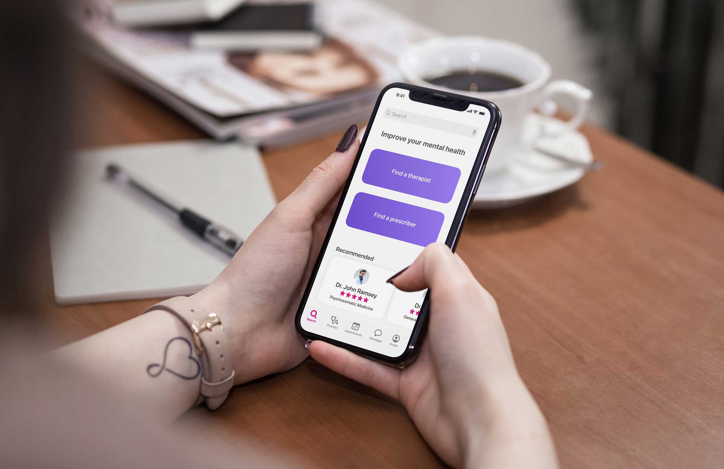
MindAid is a tele-health application designed to help users manage their mental health. The platform connects users with therapists and prescribers through online video appointments. The project focuses on native designs for iOS and Android.
Role
UX/UI Designer
Tools Used
Figma, Adobe Illustrator


Context
21% of U.S. adults experienced mental illness in 2020 (52.9 million people). This represents 1 in 5 adults.
- National Alliance on Mental Illness
Problem
Scheduling appointments with mental health providers can be difficult, especially for those struggling with mental health issues.
Goal
An easy and convenient way for people to schedule mental health appointments and conduct calls from the comfort of their own home.
Competitive Analysis
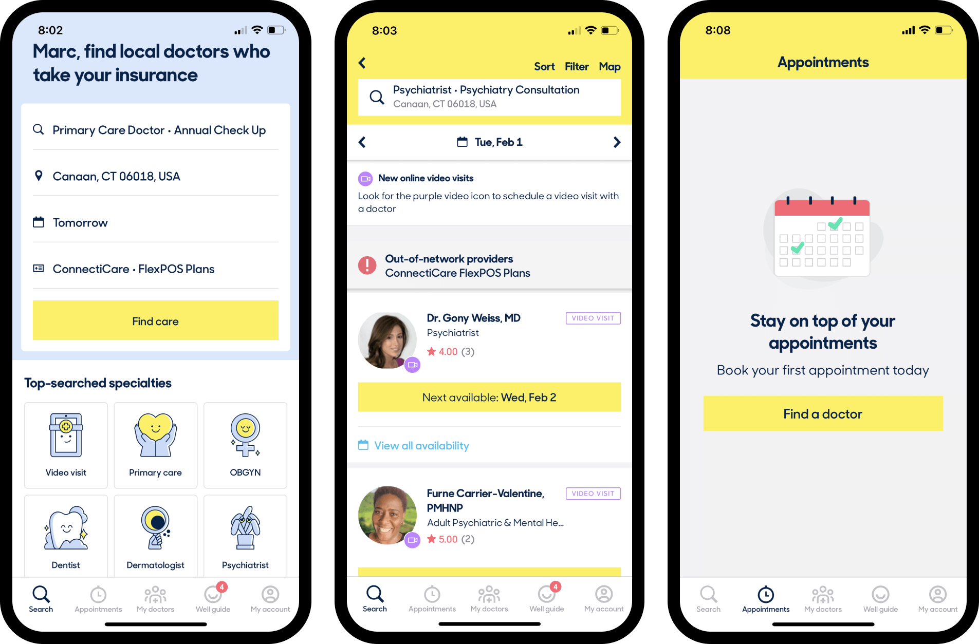
ZocDoc
Positives:
- Offers many different types of care
- Video and in person visits
- “Well guide” helps users keep up with appointments
Negatives
- Cluttered UI
- Highly saturated color use creates contrast issues and difficulty viewing certain elements
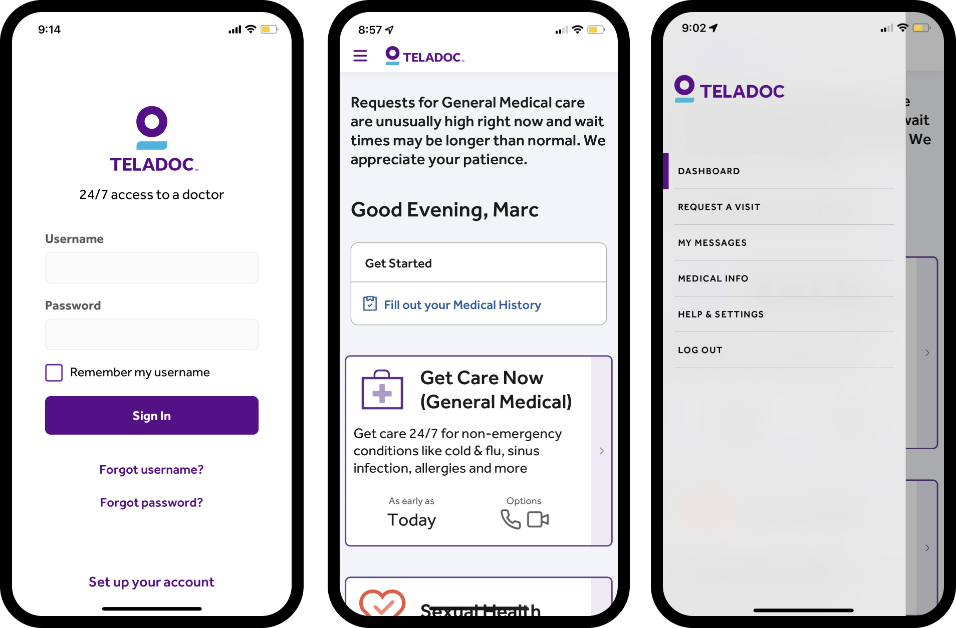
Teledoc
Positives:
- Clean and simple design
- Easy to read text
- High contrast color choices
Negatives
- Users are not able to pick and choose specific providers
- Long and tedious questionnaires
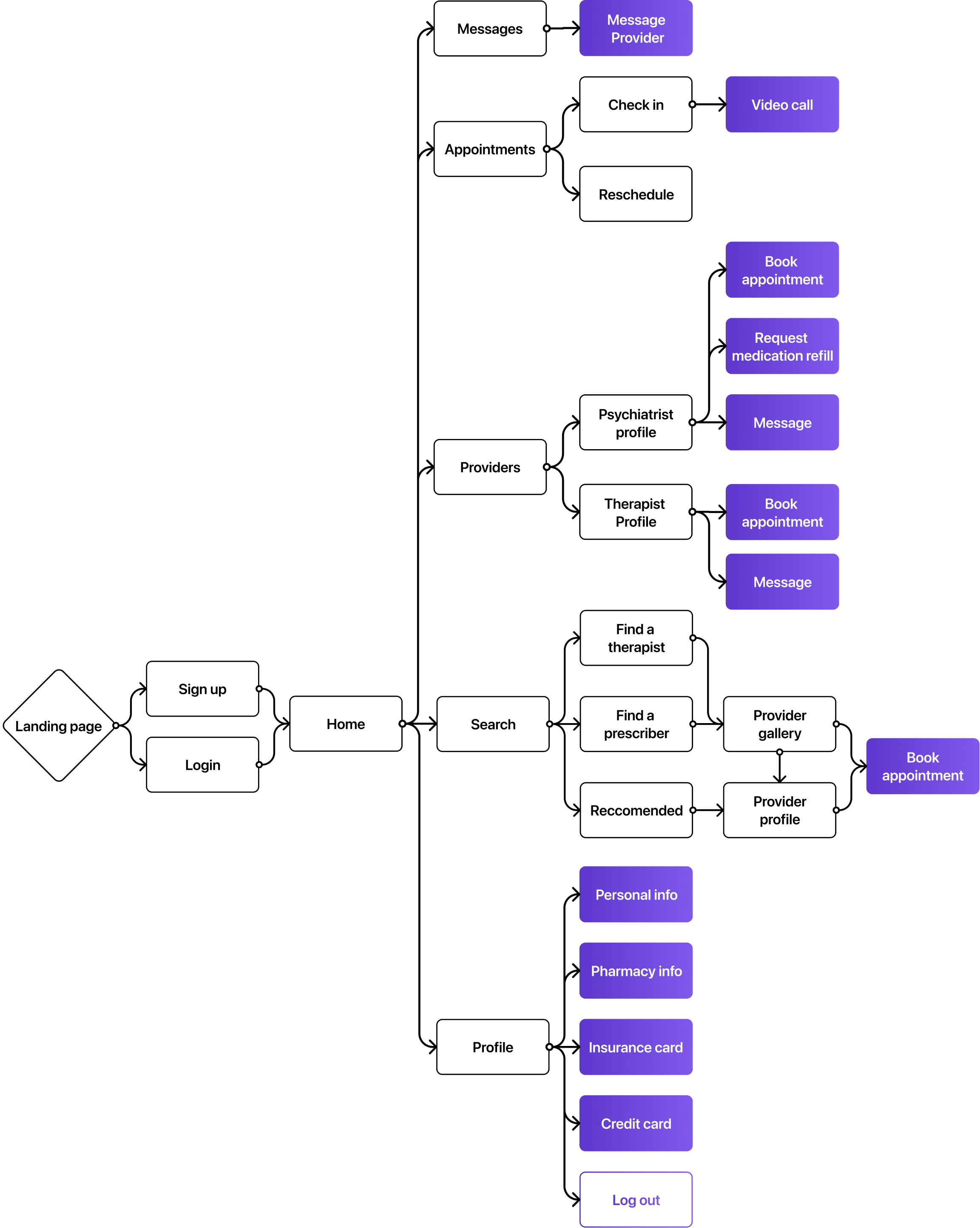
User Flow
Objectives:
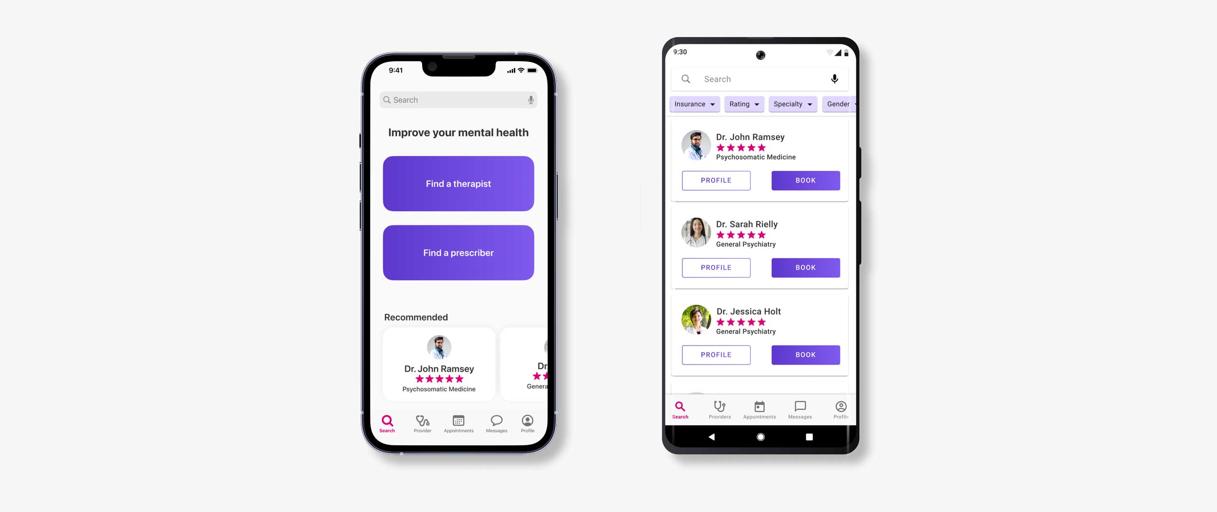
- Find a prescriber
- Find a therapist
- Book an appointment
- Complete a video call
- Message a provider
- Request a medication refill
- Add insurance card
- Add credit card
- Add pharmacy information
Low Fidelity: iOS
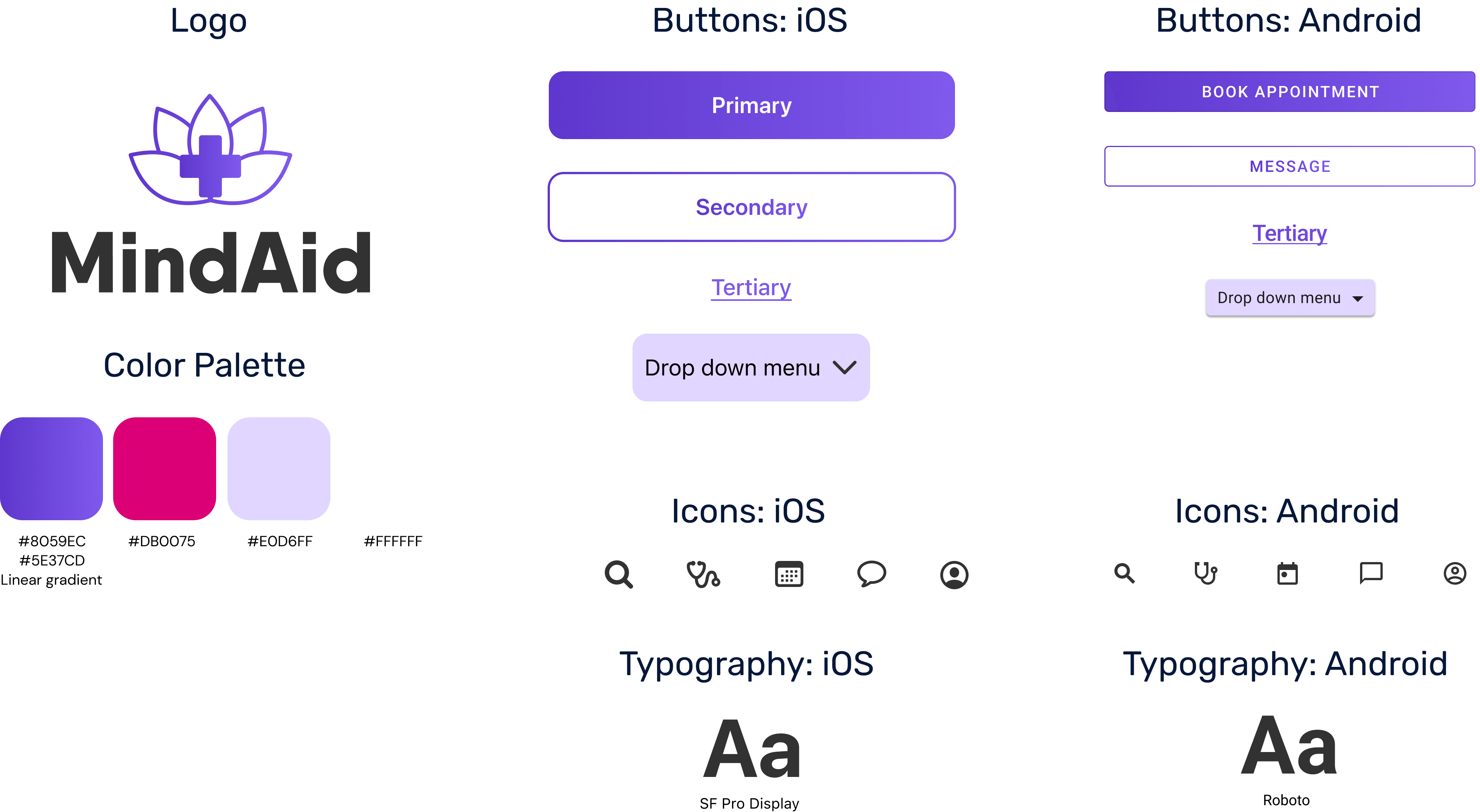
Low fidelity frames were created based off of Apple's human interface guidelines. These low fidelity frames include iOS icons, SF Pro type, iOS button designs, and iOS card designs
Low Fidelity: Android
Another set of low fidelity frames were created based off of Google's Material Design. These low fidelity frames include Material icons, Roboto type, Material buttons, and Material cards.
Style Guide
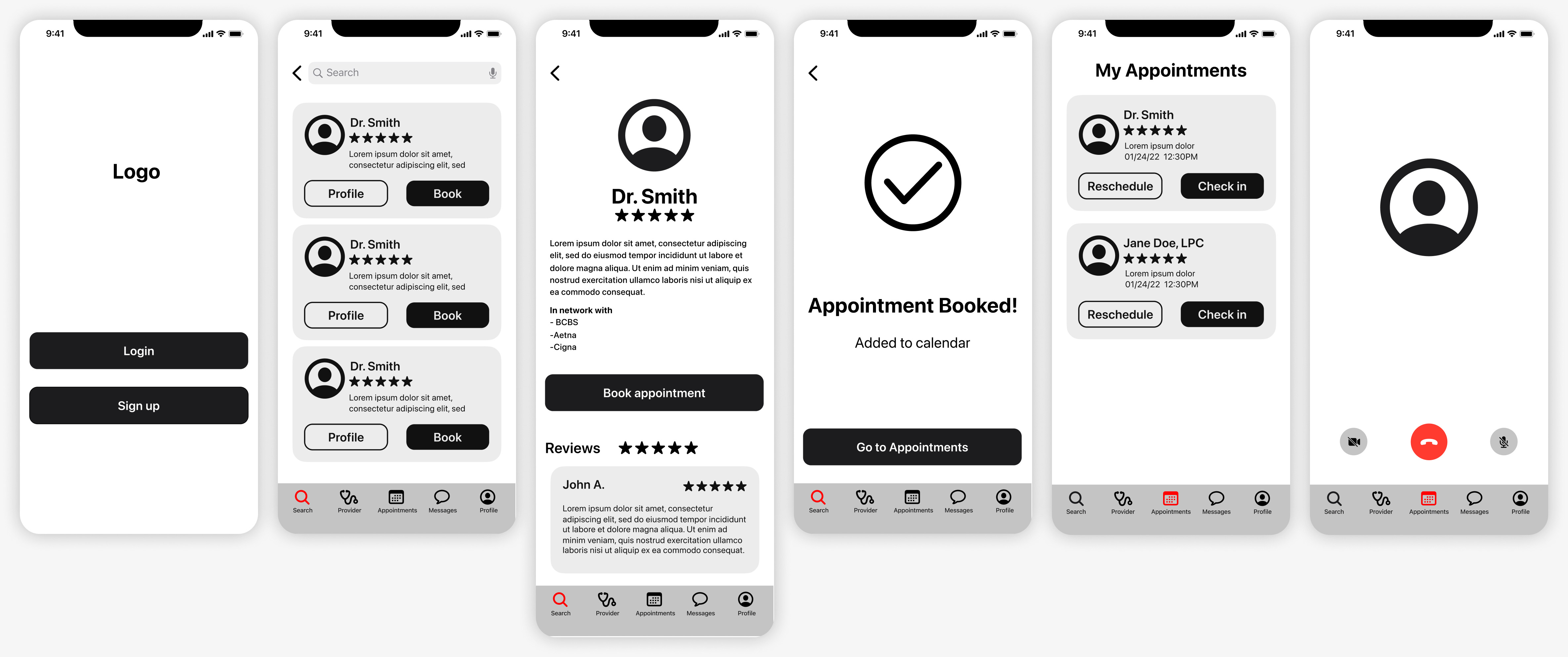
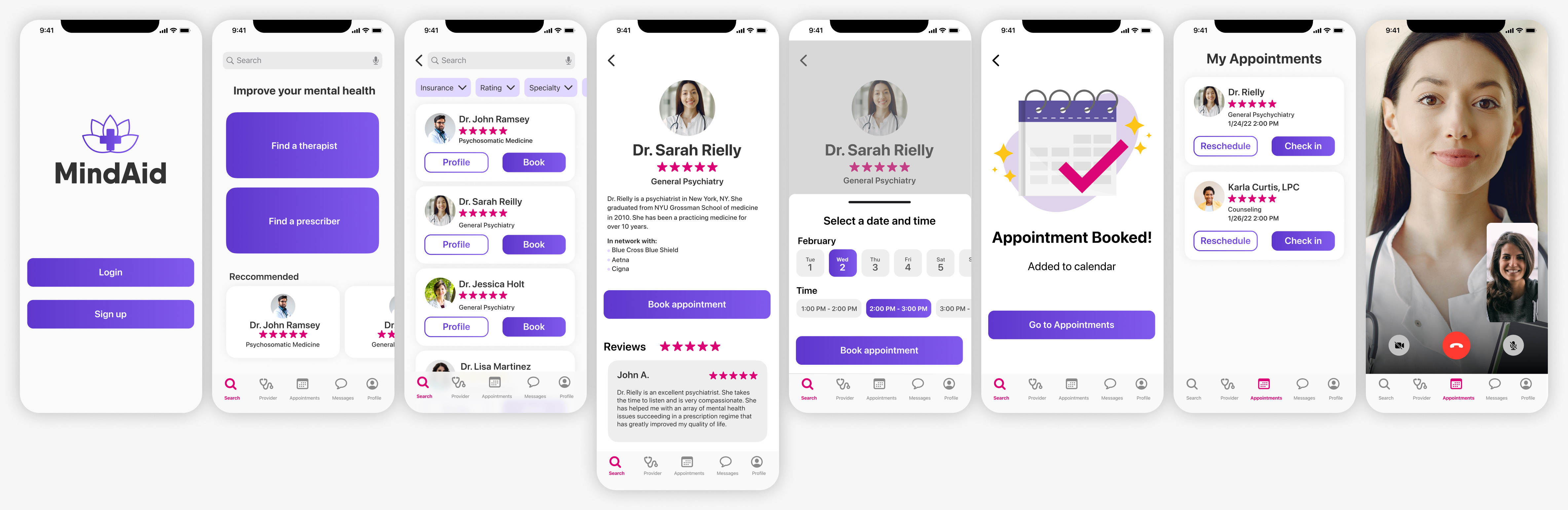
High Fidelity: iOS
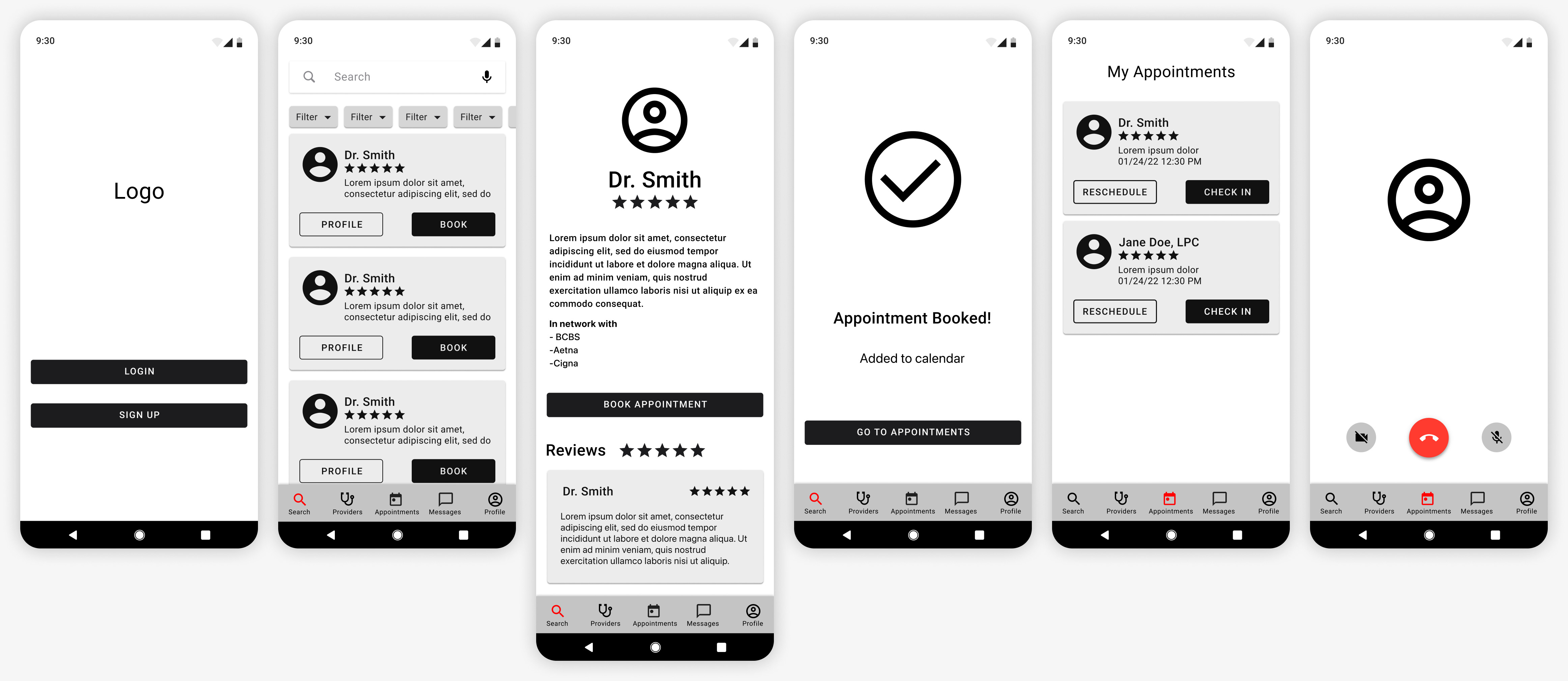
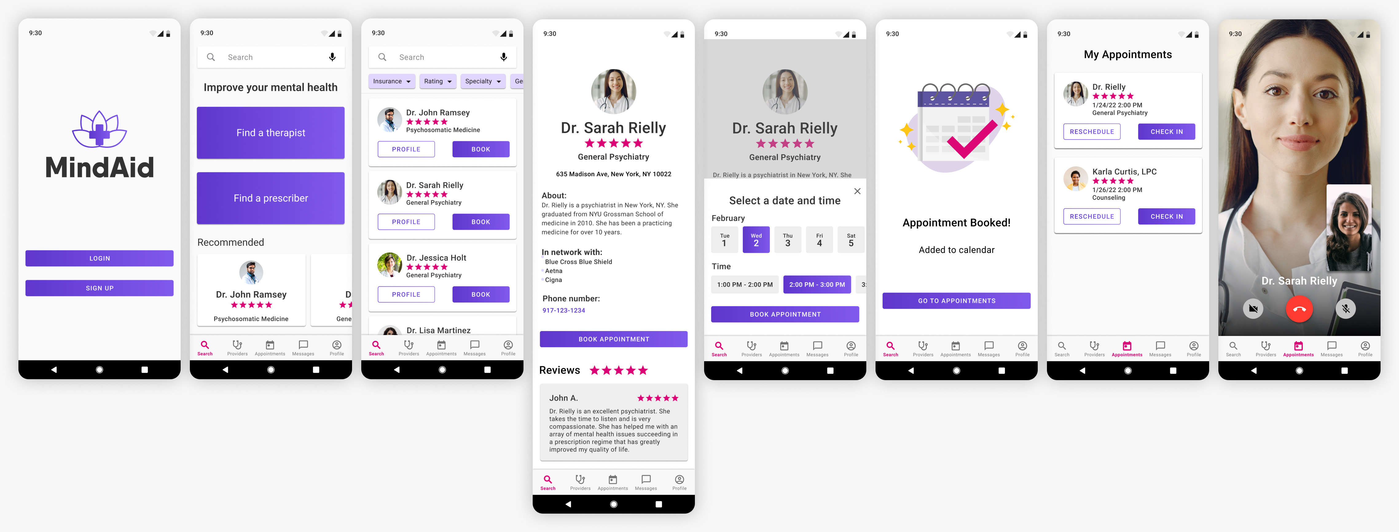
High Fidelity: Android
User Testing
Prototypes were created using the high fidelity screens. One version for android and one version for iOS. The prototypes were tested on seven different participants.
Try the protoypes out below!
Key Take-Aways
- Users wanted to a way to edit or remove providers
- Phone numbers added for providers
- Text hierarchy adjusted for provider profiles for easy readability
- Appointments rearranged from latest to oldest
- Provider name added to Video calls
- Time stamps added to messages
iOS Prototype
Android Prototype
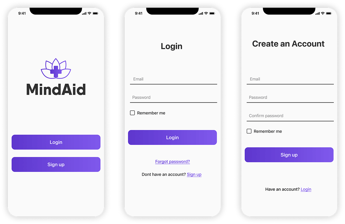
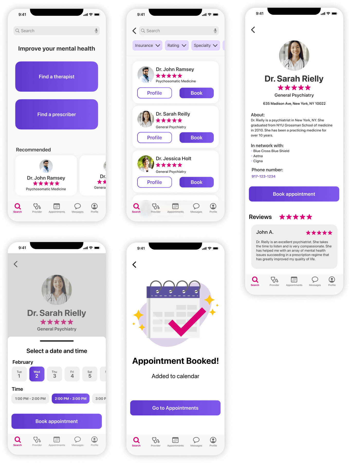
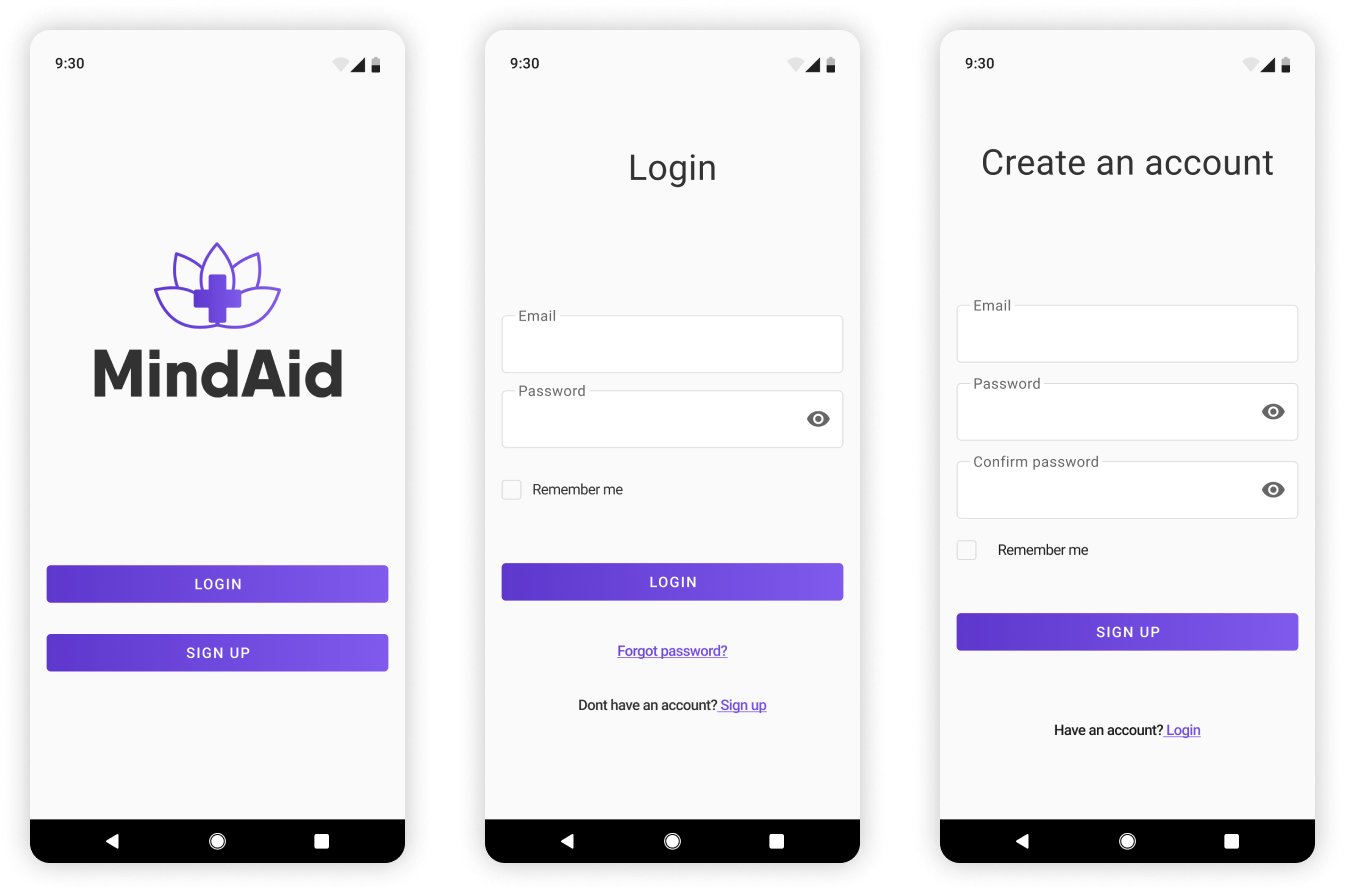
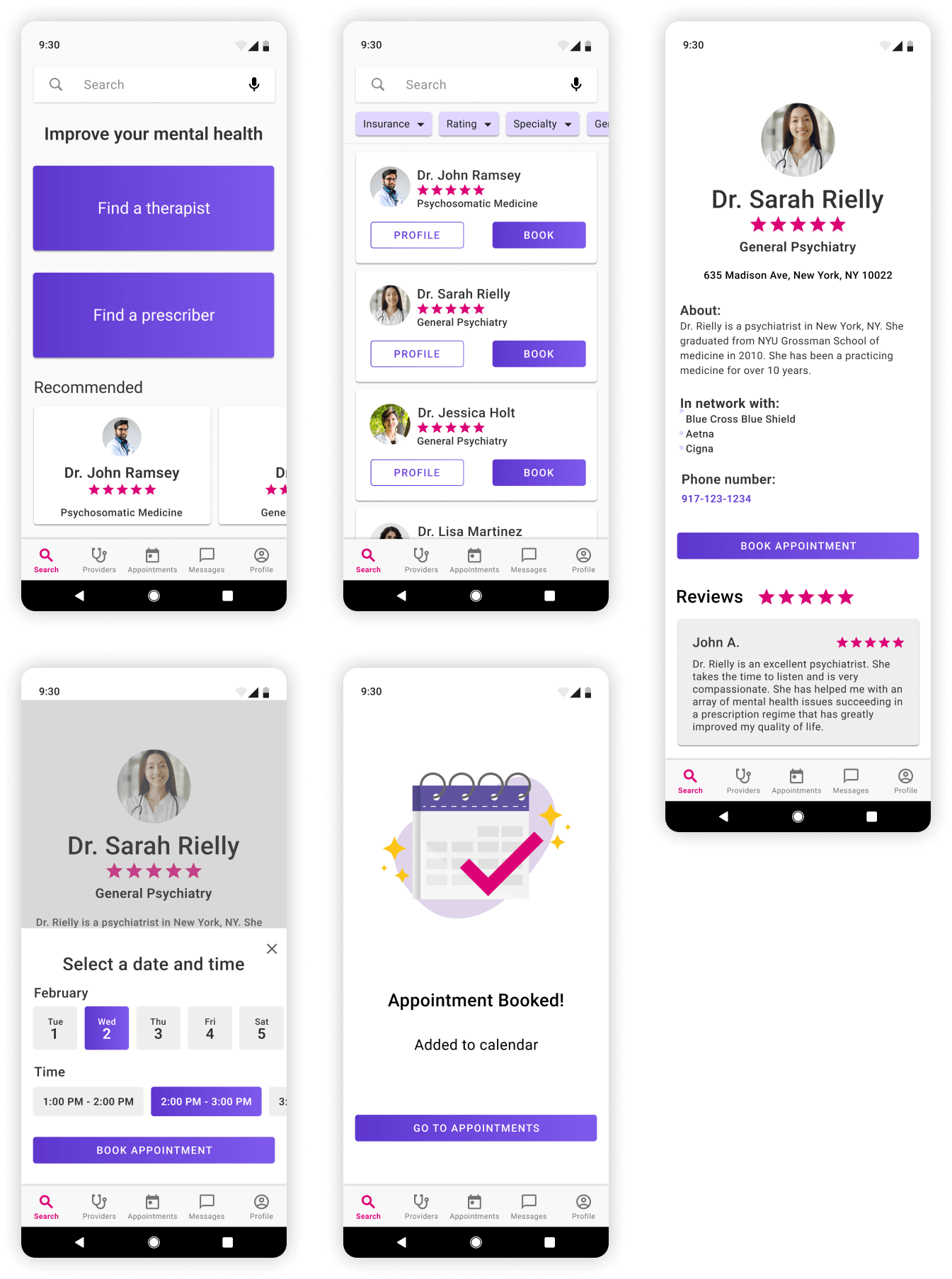
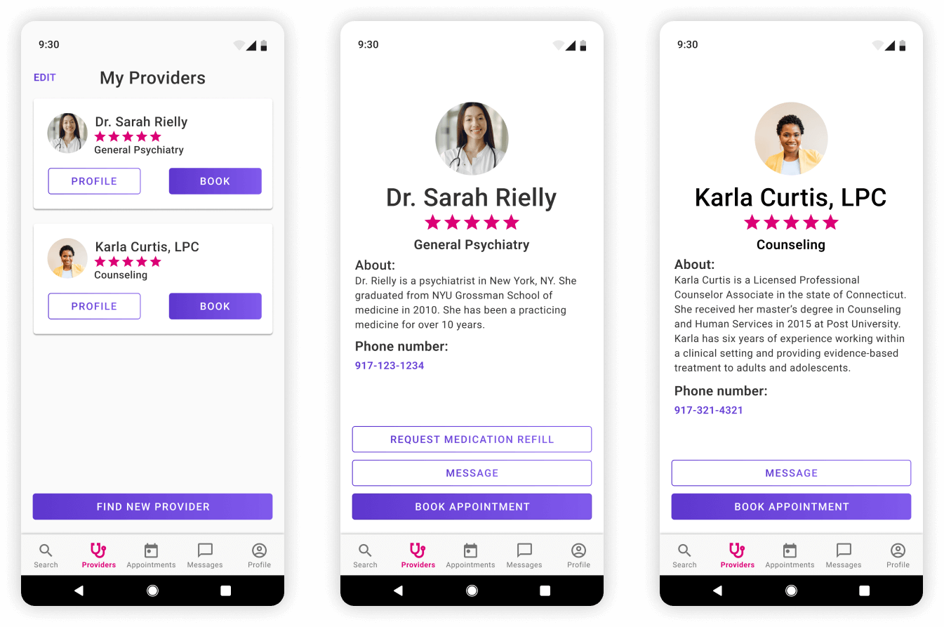
Final Screens: iOS
Login
Search Provider/Book Appointment
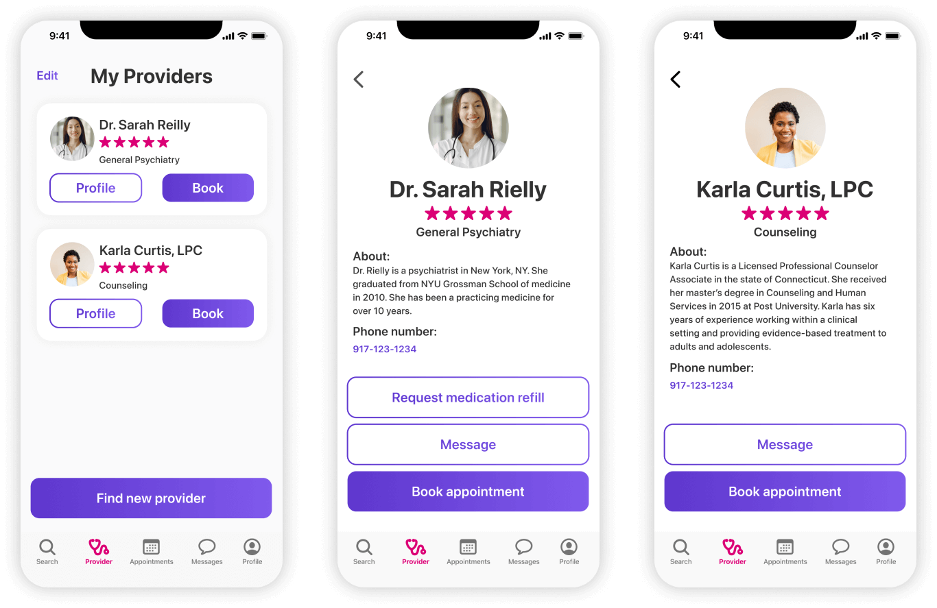
My Providers
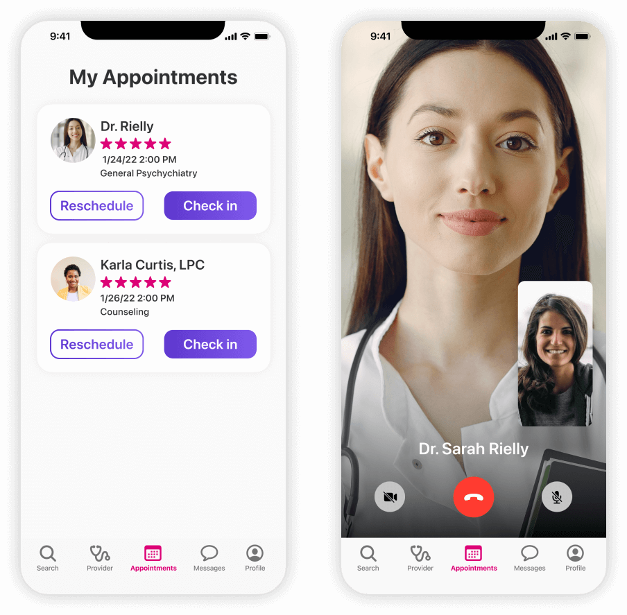
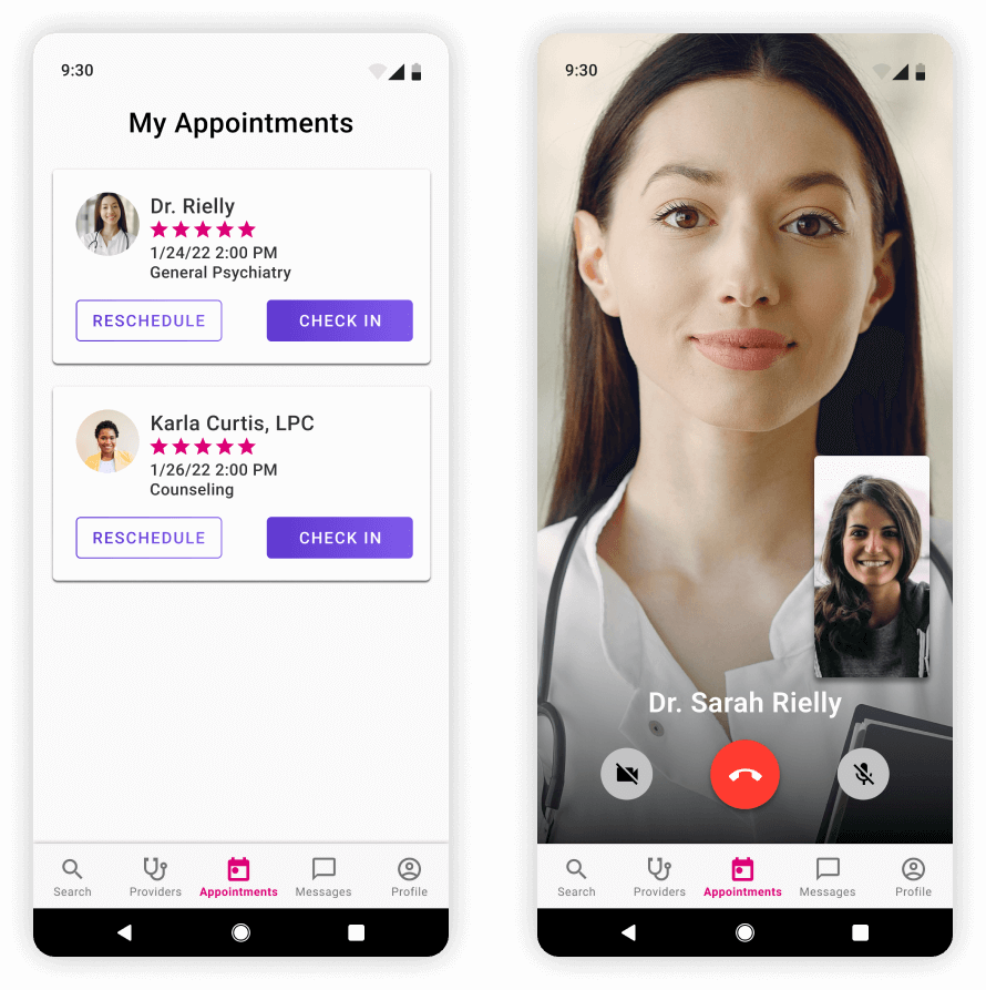
Appointments/Video Calls
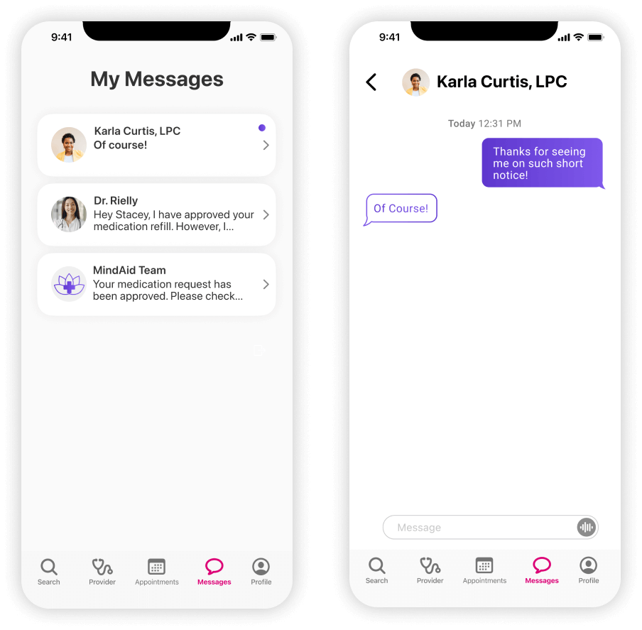
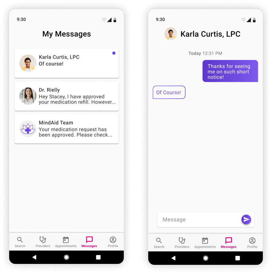
Messages
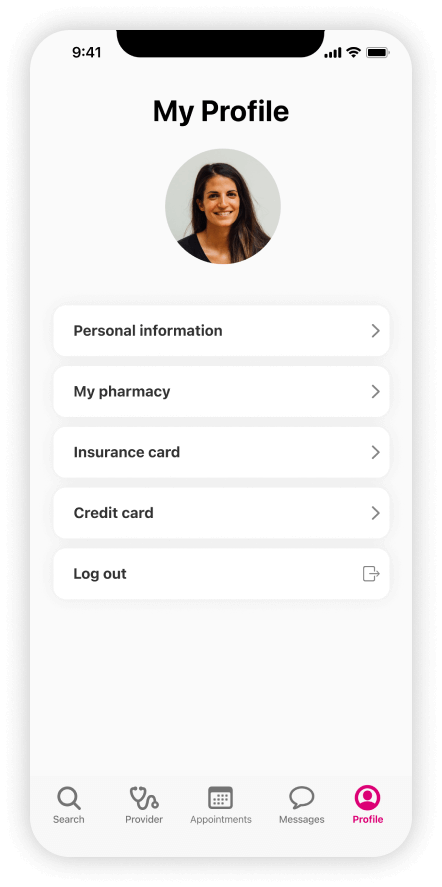
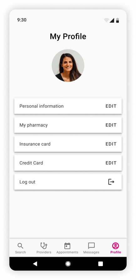
User Profile
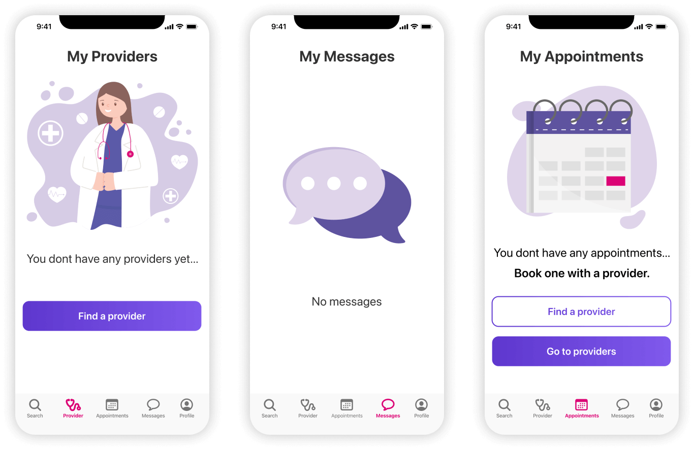
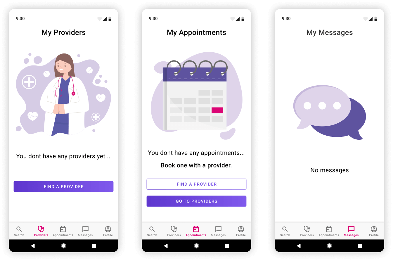
Empty Screens
Final Screens: Android
Login
Search Provider/Book Appointment
My Providers
Appointments/Video Calls
Messages
User Profile
Empty Screens